
.png)
%20(1).png)
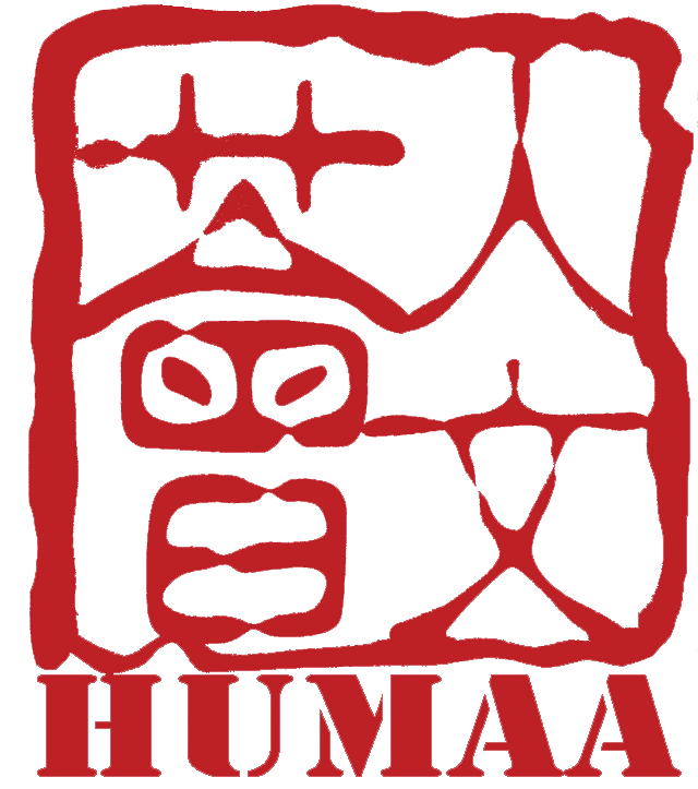
一顆珍珠的誕生 The Birth of a Pearl
標誌的創作理念和故事 The Idea of our Logo and the stories behind
三十週年的標誌,由HMW學生阿凱創作。
阿凱喜歡概念上的交流和對話。他坦率地說為三十週年設計標誌的原因是想學習和嘗試設計。
當時討論Logo光是初稿就已經有40多張,讓籌委會成員都花了一輪功夫才選出這個版本。阿凱的作品真是「粒粒皆辛苦」。
%20(1).png)
標誌的創作理念如下:
「人文及創作,原是生長在不同大海的兩顆珍珠。三十年間,無限無窮的創作力量與意志相遇,兩者合二為一,在恰好的保護下,就育成了如希望一樣的一顆珍珠。
揭開,會見到蘊藏已久的光芒。」
不知道你眼中的HMW學生是怎樣的?熱愛想像和創作,又勇於嘗試,可能就是HMW同學的最佳形容。
The 30th Anniversary logo of HMW was created by HMW student, Laurent Wong.
Laurent loves conceptual communication and conversation. His logo design was informed by the fact that he wants to learn and try new things. They went through more than 40 drafts before it arrived at the final version. It takes time to produce a pearl!
The idea of the logo:
“Humanities and Creative Writing originally were twin nurtured by two oceans. In these 30 years, the endless and infinite creativity and understanding of humanities will met each other and combine as one. Raised by the suitable protection, the department became a pearl, as well as a hope.
Unveil it, and you shall see the lights hidden for so long.”
Enthusiastic about imagination and creation, as well as eager to try, maybe are the best description of HMW students.